Vitruvian Man
 To introduce us to the Florentine Renaissance, Kenneth Clark in Civilisation gives us the images of one-point perspective, beautiful sculptures by the Ninja Turtle namesakes, and Leonardo da Vinci’s familiar Vitruvian Man.
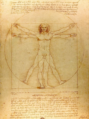
Of these, the last image is the most potent to me. As a child, I saw the man inscribed in a circle and a square countless times, on television, in books and museums. Most of Da Vinci’s fantastic drawings were inventions, which inspire the imagination with images of 15th century Italian helicopters, but Vitruvian Man simply tries to fit a man in a circle and square. What purpose does it serve?
To most people, I think, it means nothing at all. It is just one stray column scattered among the ruins that modern men walk through; a symbol which once had value but is now displaced and meaningless. A curious young boy might check Google, but he would be disappointed. Wikipedia banally drones that the Vitruvian Man “exemplifies a blend of art and science”, which is silly nonsense. Geometry is not science. In fact, for the Classical author who inspired the work, geometry was metaphysics.
The text around Da Vinci’s drawing quotes, as a direct model for his figure and his use of a square and circle, the Roman architect Vitruvius’ long explanation of the proportions of man: “The length of the foot is a sixth part of the height of the body, the forearm a fourth part,” and so forth. Vitruvius was not trying to describe his own body, or that of his friend, or an average Roman body, but rather “a well formed human figure”– a being whose splendid proportions were coming to resemble geometric perfection.
Vitruvius continues: “If Nature, therefore, has made the human body so that the different members of it are measures of the whole, so the ancients have, with great propriety, determined that in all perfect works, each part should be some aliquot part of the whole; and since they direct, that this be observed in all works, it must be most strictly attended to in temples of the gods, wherein the faults as well as the beauties remain to the end of time.”
The ancients, as Spengler points out in the very first chapter of Decline, worshiped rational, perfect figures, and detested, even outlawed, the irrational and disproportionate. Vitruvius does not seem to really understand Pythagorean number theology, but he grasps the unnatural, otherworldly, and outright Godly nature of numeric ratios and geometric forms. As an architect, how could he not?
Da Vinci’s artistic imagination is piqued by this “well-formed” man. For the Italian polymath, the Vitruvian Man is a gesture towards divinity. It is an invitation to draw a man who, rather than taking the form of local personalities of Florence as the other Renaissance artists have been doing, aspires to the form of Euclidean geometry, and thereby to something higher and more ancient than the narcissistic whims of a patron. Da Vinci illuminates the Vitruvian Man with his circle and square, as a scribe might illuminate a Bible.
The idea of perfect proportion is inherited from Rome, but the execution of that proportion in a beautiful image is Florentine. A sort of false start, to be sure, in Western civilization, lacking the characteristic Faustian trade of nobility for popularity; but nonetheless, an early modern, Western production drawing on a centuries-old source of tradition.
“Mathematically, I’m fairly sure it is a cheat, but aesthetically, it has some meaning, because the symmetry of the human body and the relationship of one part of it to another do influence our sense of normal proportion,” philosophizes Clark, while sitting in the contemporary and beautifully proportioned Chiostro Grande of the Basilica of Santa Croce. Normal proportion! A “normal” sized human! What a thought, and one that reminds us of the ever-growing gap between Da Vinci’s day and our own.
Even if its deeper meaning has become difficult to grasp, Vitruvian Man remains, as it was in the 15th century, a clear tribute to geometry and beauty. Both of these things are under direct attack by the culture creators. Vitruvius’ admonition to construct “ideal buildings” that are “sturdy, useful, and beautiful” has collapsed into building less than ideal mass-market constructions that are none of the above. Even high architecture abandoned the frighteningly perfect arches of Euclidean geometry long ago, opting for any kind of hesitant and irrational curve in its place, even if it means flat out trash. Pleasant symmetries are apparently popular to look at in museums and ruins, but not popular to build.
As for the body, my readers should hardly need help to deconstruct Da Vinci’s cultural supremacism. There are so many people left out by this image: fat people, skinny people, the short, the tall, women and minorities. Who are you to say that one form is more beautiful than another? Don’t you find the choice of one perfect white man to fit into a perfect circle vaguely fascist? Do you really consider this picture appropriate for a large and diverse community?
Tags: realism, traditionalism


